Implementing Modals in Bootstrap 5: A Comprehensive Guide with Examples

Introduction
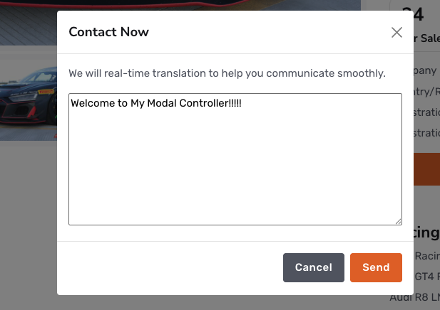
Modals are essential UI components that overlay the main content to display supplementary information or user inputs. Bootstrap 5 offers a robust modal component that is easy to implement and customize. This guide explores the creation and management of modals using Bootstrap 5, accompanied by practical examples.
Creating a Basic Modal
To create a modal in Bootstrap 5, define the modal structure and include a trigger element, such as a button, to activate it.
HTML Structure:
hExplanation:
Trigger Button: The button utilizes
data-bs-toggle="modal"anddata-bs-target="#exampleModal"attributes to control the modal.Modal Structure: The modal is defined with the
modalandfadeclasses for animation. It includes:Modal Header: Contains the title and a close button.
Modal Body: The main content area.
Modal Footer: Contains action buttons.
Customizing Modal Size
Bootstrap 5 allows customization of modal sizes using specific classes:
Small Modal: Add the
modal-smclass to.modal-dialogfor a small modal.Large Modal: Use the
modal-lgclass for a large modal.Extra Large Modal: Apply the
modal-xlclass for an extra-large modal.
Example:
<div class="modal-dialog modal-lg">
  <!-- Modal content -->
</div>
Centering the Modal
To vertically and horizontally center the modal, add the modal-dialog-centered class to .modal-dialog.
Example:
<div class="modal-dialog modal-dialog-centered">
  <!-- Modal content -->
</div>
Scrollable Modal Content
For modals with extensive content, ensure usability by making the modal body scrollable. Add the modal-dialog-scrollable class to .modal-dialog.
Example:
<div class="modal-dialog modal-dialog-scrollable">
  <!-- Modal content -->
</div>
JavaScript Control
Bootstrap 5 modals can be controlled programmatically using JavaScript. Initialize a modal instance and use methods like show() and hide().
Example:
var myModal = new bootstrap.Modal(document.getElementById('exampleModal'));
myModal.show();
Best Practices
Accessibility: Ensure modals are accessible by including appropriate ARIA attributes.
Focus Management: Manage focus within the modal for better user experience.
Responsive Design: Test modals across different devices to ensure responsiveness.
Conclusion
Implementing modals in Bootstrap 5 enhances user interaction by providing a seamless way to display additional content without leaving the current page. By following this guide, you can create effective and accessible modals tailored to your project's needs.
For any issues or customization needs, feel free to reach out to us at 📧 tentech.ai.2023@gmail.com.